Your wedding colours are the anchor for your big-day décor. Inspired by your personal style, your venue and the season, the wedding colour palette you choose will help guide many of your decisions, and ensure the whole day feels cohesive and polished.
When thinking about your wedding colour scheme, there’s a useful rule of thumb to keep in mind – the 60:30:10 ratio. Choose one main colour (to be used as 60%), then select one or two secondary shades (for 30%), followed by a fun accent shade – such as a metallic gold or silver – for your 10% to be used sparingly throughout your event.
In need of some colour inspiration? Here are four wedding colour palettes we’re loving right now…
Photographer: @darcybenincosa
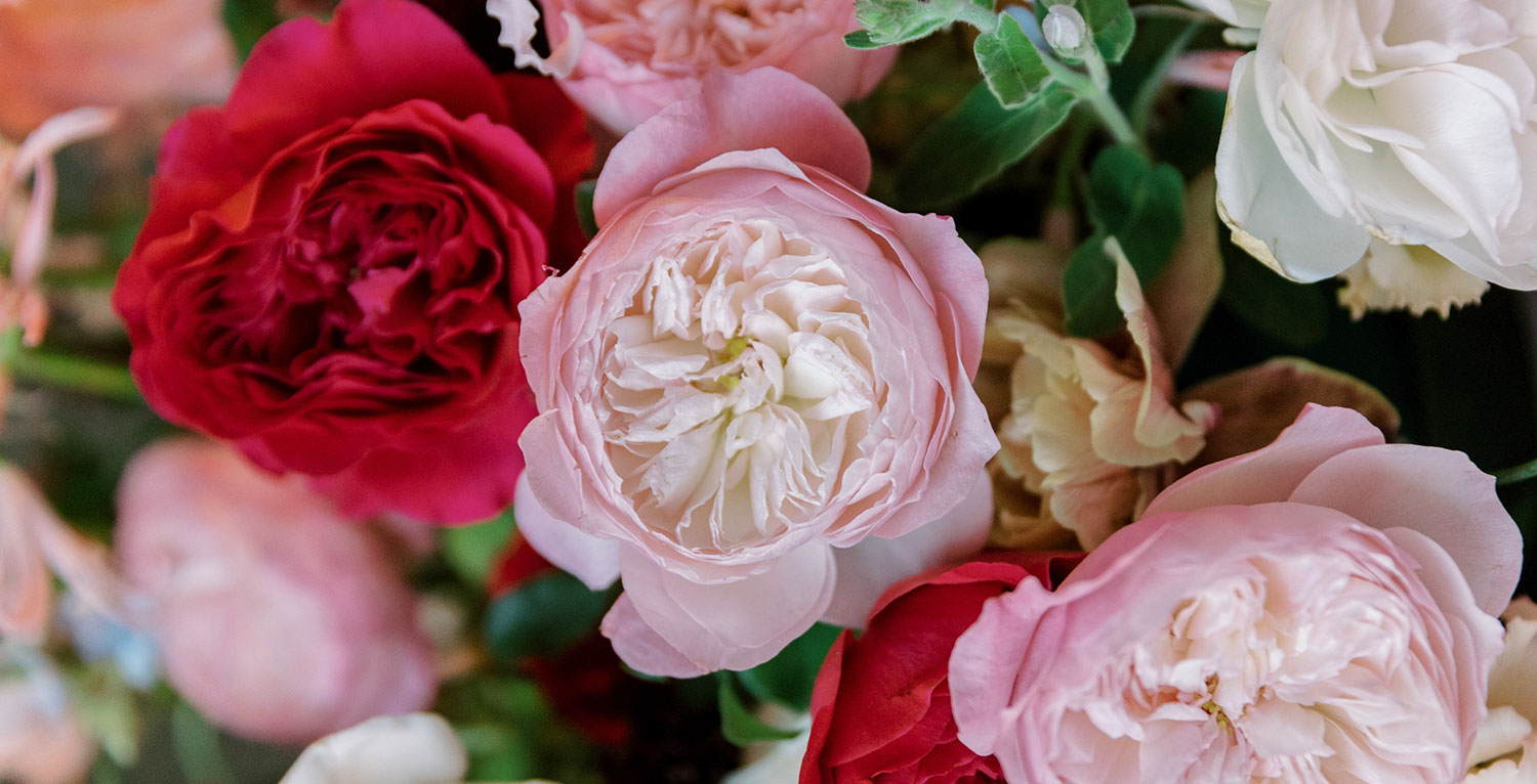
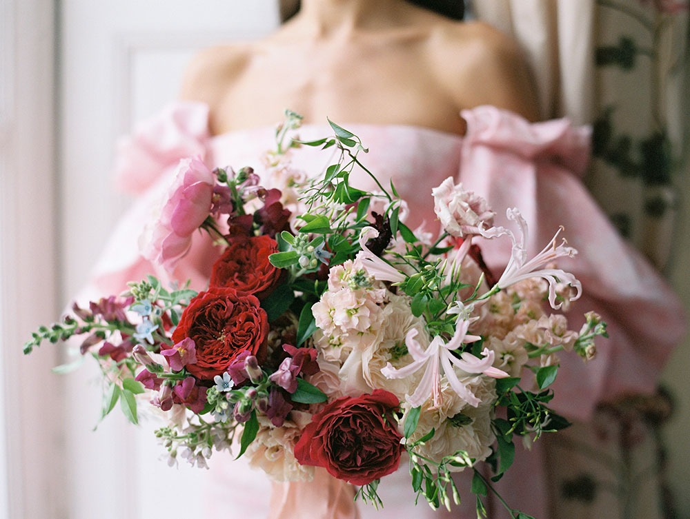
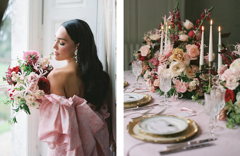
Red and Pink Wedding Colour Palette
We can’t get enough of pink and red styled together, it’s just so fresh, feminine and modern. If you’d like to make a statement with your bridal look, consider a pink wedding dress like this incredible off-the-shoulder pink Monique Lhuillier gown, which perfectly highlights the marshmallow pink of our Constance rose. If you’re more of a traditionalist in your fashion tastes, why not add pink table linens or napkins instead? Styled with sumptuous red and pink roses, gold hardware and taper candles creates opulence and theatre to wow your guests.
Try playing around with different tones of red and pink to find a combination that suits your personal style. We love burgundy and blush; cherry red and marshmallow pink; coral and hot pink… there are so many beautiful pairings, you’ll be sure to find one that feels just right. For more ideas with this colour scheme, take a look at our Dutch Masters’ wedding flower inspiration.
Floral Designer: @floraisonparis
Planning, Design, & Styling: @rsvpeventdesigns
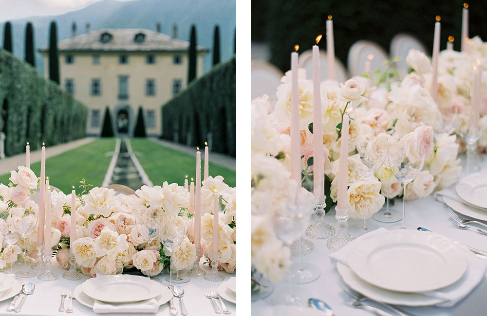
Blush And White Wedding Colour Palette
Forever romantic, feminine and versatile, blush and white is a timeless colour combo for a classic wedding like this elegant soirée at Villa Balbiano in Lake Como, Italy. The outdoor wedding reception on the villa grounds is absolutely spectacular, with an extravagant rose-filled table runner made up of Eugenie, Leonora, Charity, Purity and Keira, interspersed with pale pink taper candles.
The manicured trees and stately facade of the historical villa provided the perfect backdrop for the romantic early evening event, with the fragrant roses and twinkling candles all adding to the soft ambience. The absence of greenery within the floral design adds a feeling of luxury and elegance. If you are planning a destination wedding at Lake Como, take a look at our blush wedding blog post.
Photography, Design & Florals: @jannabrowndesignco
Bold Pink And Blue Wedding Inspiration
Blue and pink is a pretty nostalgic colour palette that has a sweet and familiar feel. The coolness of blue is warmed up by the heat emanating from the red undertones of pink, while blue acts as a counterpoint to the sweetness of pink. In this beautiful reception space at The Ivy Rose Barn in Virginia, stylist Joy Proctor used blue to anchor the décor and give it a modern and elegant feel.
Soft blue tablecloths, napkins and hand-painted candles pick out the delicate blue supporting flowers and complements the bold pink Constance, Miranda and Juliet roses. Joy also incorporated natural materials with wooden chairs, and whitewashed rattan chargers and vases, to bring an organic feel to the reception space. Pretty hand-painted name cards and menus by Arabella June add a summery finishing touch. If you are planning a bold pink wedding take a look at our Pink Indoor Reception blog for more ideas and inspiration.

Photographer: @lauragordon
Floral Designer @bowsandarrowsflowers
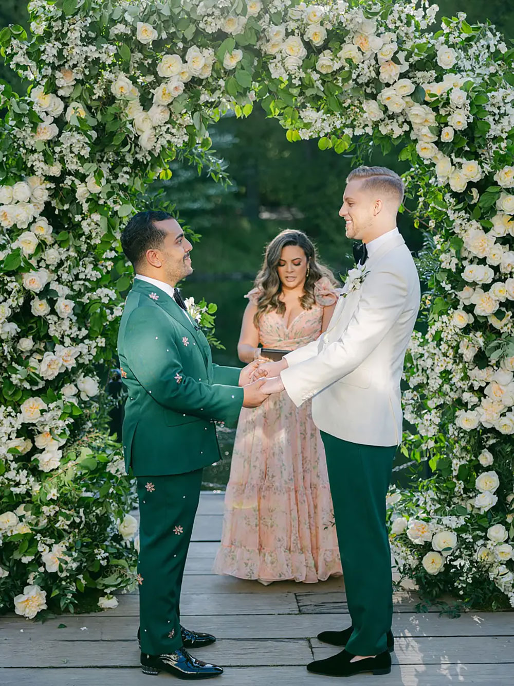
Green And White Wedding Inspiration
Green often takes a supporting role in wedding décor design but why not give it centre stage? Oliver and Nick’s spring wedding at the Boathouse in Brooklyn, New York celebrated the beauty of nature with a fresh, clean white and green-heavy colour palette that reflected the natural verdant surroundings in Brooklyn’s Prospect Park. Leonora, Patience, Eugenie and Purity roses were used throughout this fresh, clean, yet romantic city wedding colour scheme.
The wedding colour palette highlighted the Verdigris green details of the venue and shades of green were woven throughout the stationery and signage as well as the groom’s attire and floral design. Even the wedding cake was a gorgeous shade of Verdigris, as well as the vintage rotary dial telephone where guests were invited to leave messages for the happy couple. If you’re planning a city wedding take a look at our New York City Real Wedding blog for more inspiration.